Ecommerce Web Design: Best Practices & Examples

Almost 80 to 90% of e-commerce sites fail. One proven reason for failure is poor ecommerce web design, which includes lengthy checkouts and ignoring Mobile UX. Only if you get your ecommerce web design right will your website survive and attract leads and conversions.
Implement these nine design best practices without any second thoughts. Retailers are already using them to succeed in this overcrowded ecommerce marketplace. Look at the examples to better understand how things should be done.
Without further ado, let’s explore these design practices:
1. Prioritize Mobile-First Design Ecommerce Web Design
The e-commerce industry has grown significantly in recent years and is expected to reach US$5 trillion this year, a 15% annual growth rate from 2019 to 2024. But then, it’s M-commerce or Mobile Commerce running the E-Commerce sales show.
With the increase in smartphone use, mcommerce sales have contributed significantly to ecommerce. According to Statista, from 43% in 2018, mcommerce sales as part of ecommerce are projected to leapfrog almost 63% by 2028.
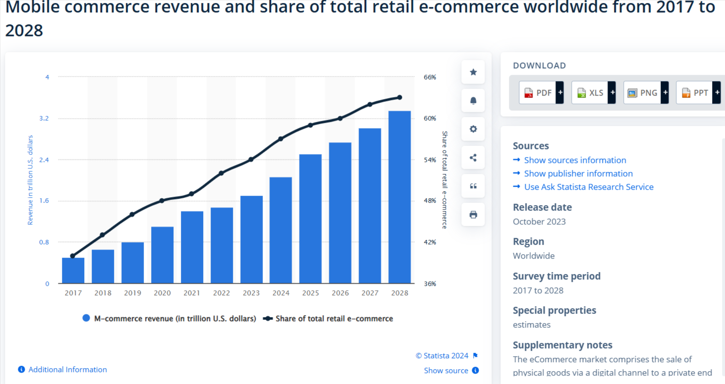
Mobile phones have become the starting and end point of e-commerce purchases, and a good portion of such sales can be attributed to voice-controlled devices, too. Nearly 125.2 million consumers are said to have used voice search to make online purchases in 2023.
So, no matter what, make your website responsive for smaller screens in 2025. This means optimizing images and buttons for touch interactions and simplifying checkout to ensure better lead conversions.
Example: Inventure is fully optimized for mobile, with crystal-clear CTAs, font sizes, color contrast, and content perfectly suited to mobile screens. It also offers safe and fast loading. The website has specifically ensured that background animations and parallax scrolling don’t affect the load times.

2. Simplified Checkout Process
Since we are on checkout, let’s elaborate a bit. The checkout process is a crucial part of the customer journey, and any tiny issue could mean a lost customer.
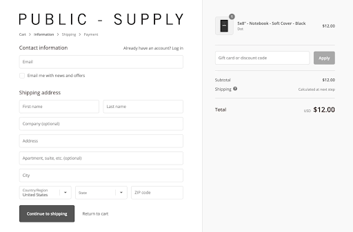
This means the checkout process should be quick and intuitive, and if possible, a one-page checkout should be created. A guest checkout option should also be provided, as it excuses the visitor from creating a mandatory account. No, that’s not enough. Providing progress indicators will help the user understand the different stages of the checkout process, and CTA buttons enhance the user experience.
Making the checkout process effortless increases the conversion rates, often leading to repeat purchases, thus driving the success of your ecommerce business.
Example: Public - Supply, an online retailer, doesn’t force new customers to create an account before purchasing.
3. Add Social Proof
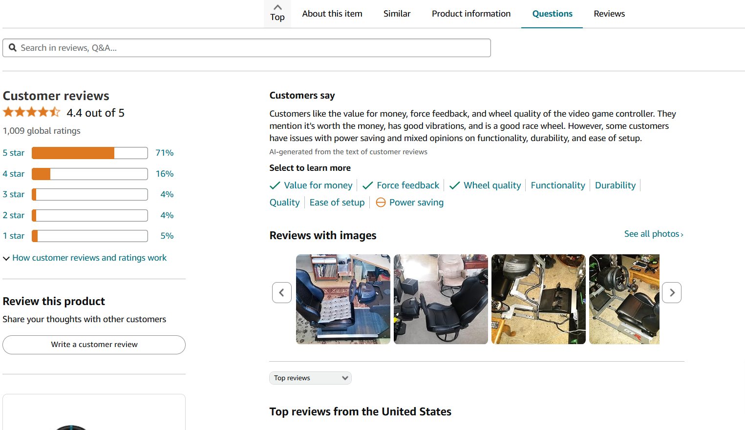
It's a given that new customers won't easily trust your products. That's why adding social proof to websites is crucial, specifically for startups or small businesses. Social proof can take the form of customer testimonials, user-generated content, or product reviews—all these review types build credibility and transparency for your website, as website visitors tend to believe the words of other shoppers.
When customers leave lovely testimonials about their good buying experience on your website, it's sure to encourage new customers to make purchases.
Besides social proof, other trust signals that could help customers believe in your brand include return policies, store contact information, security certifications, and more.
Example: Amazon.com has a separate section with star ratings and customer reviews on every product page, as you can see here.
4. Focus on Fast Loading Times
Does your website load faster? I know your next question would be, how fast? To give you an idea, the average page load time for desktop is 2.5 seconds, while for mobile, it's 8.6 seconds. Google's browser is trying to take the page speed to another level by striving to achieve less than 0.5 seconds load time.
According to Statisa, bounce rates increase around the 5-second mark.
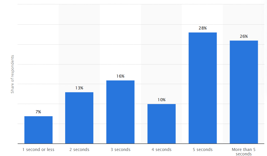
The bottom line is that if you want to reduce bounce rates and improve your search engine rankings, focus on fast load times.
One proven way to achieve this is to optimize images and videos by compressing them, minifying the code size to reduce the file size, and using Content Delivery Network to make your website faster for users worldwide.
Plus, you can plan lazy loading which ensures non-essential features of your website load only when needed. Also, you can trim down heavy scripts and cut down on HTTP requests by consolidating files.
Lastly, ensure your website is hosted on a speedy server. Don’t forget to test your website’s performance on Google PageSpeed Insights. The tool will help you identify areas for improvement.
5. Take Advantage of White Space
Are you wondering whether white space (negative space) should be part of the website design strategy? Then let me tell you, it has to be. And there can be no two ways about it.
Why? White space is actually considered a creative element in ecommerce web design by ecommerce development companies. It highlights important parts of a page, such as logos, images, text, and even CTAs. Such white spacing helps visitors skim through the content quickly. Plus, it establishes the page's visual hierarchy in terms of content flow.
A website sans any white space gives a clumsy and cluttered look.
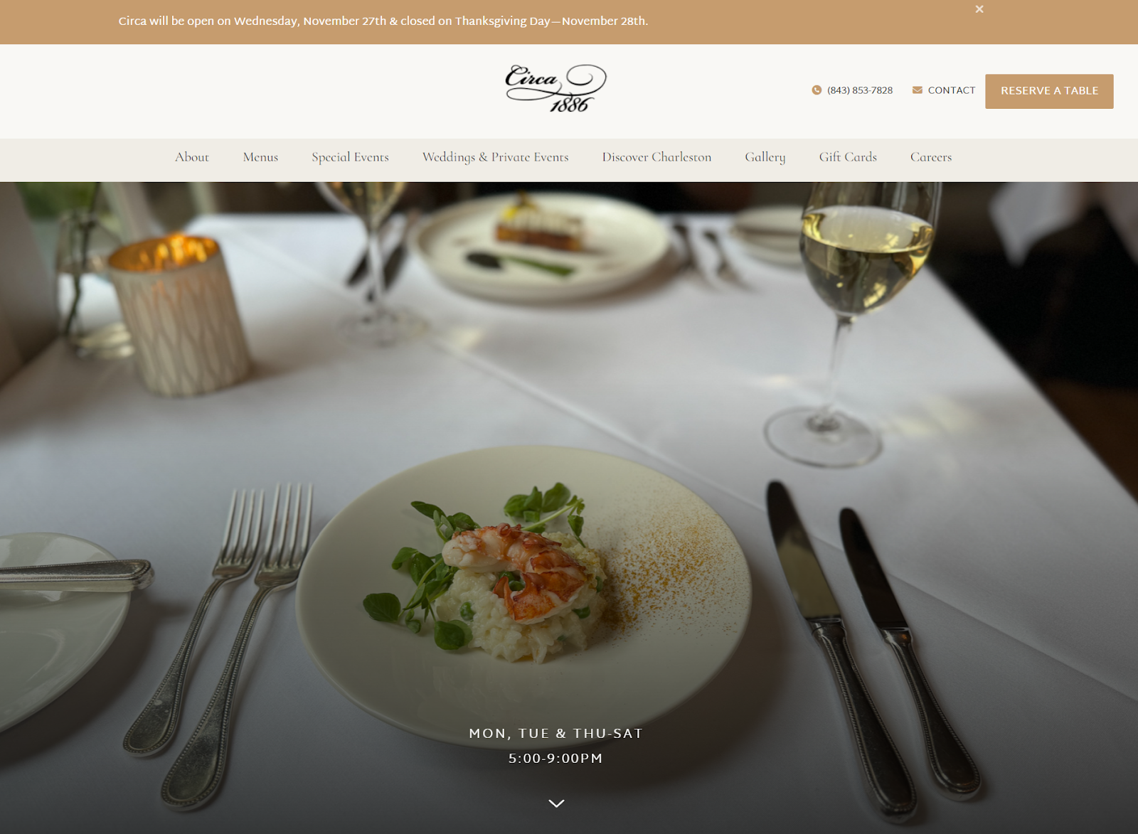
Example: Circa 1886 allows its images to take center stage. It uses everything white—white linens, white plates, and clear glassware—which helps visitors focus on the food and not the distractions around it.
6. Incorporate High-Quality Images
High-quality images aren’t optional but are a must-have for websites these days. Creating an impression on visitors’ minds is just one thing. High-quality images also improve SEO, tell visual stories, and, more importantly, boost social media engagement.
When it comes to e-commerce, high-quality website images aren’t just nice to have—they’re game-changers. Think about it: your customers can’t touch, feel, or try your products, so those images need to do all the talking. Especially in ecommerce web design, detailed, high-quality visuals are non-negotiable.
Whether it’s a close-up shot showing the texture of a fabric or a sleek 360-degree view of a product, your images can make or break that sale. In the world of ecommerce web design, great visuals don’t just showcase your products—they build trust, boost engagement, and drive conversions. So, if your images aren’t doing all that, it’s time for an upgrade!
Why? Because it can have a direct influence on your product sales. Clear-cut visuals help customers evaluate the product and make informed buying decisions. Offering multiple views and 360-degree images can help customers make quick decisions, improving user experience and customer satisfaction.
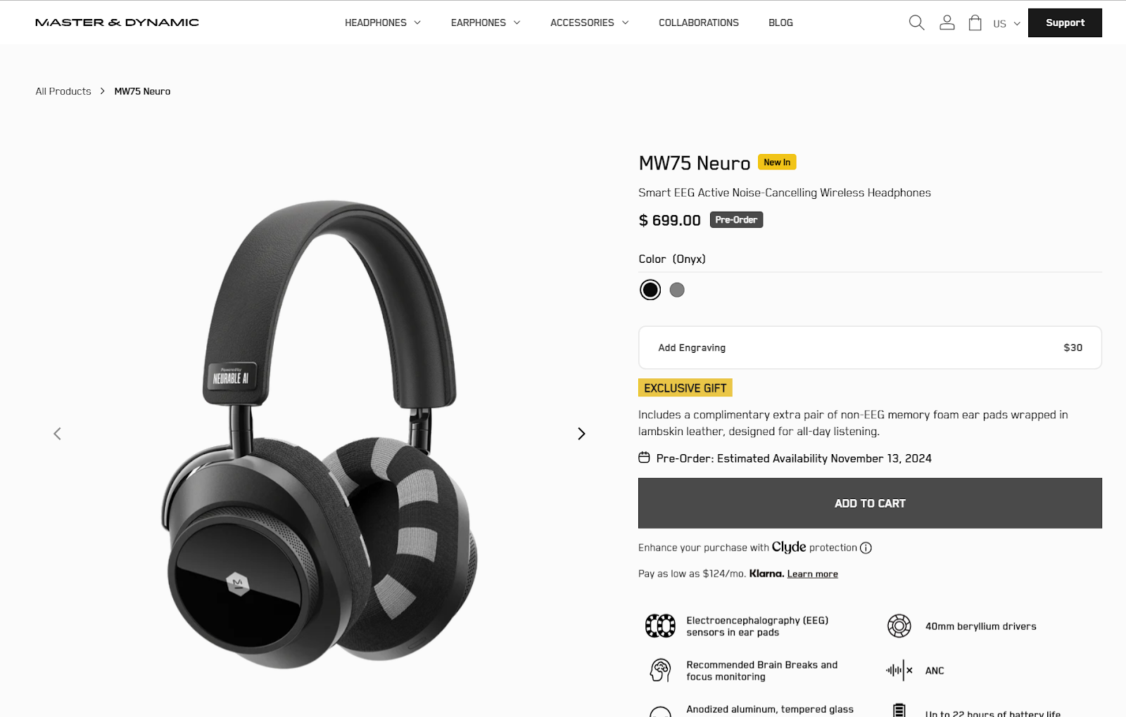
Example: Master & Dynamic highlights product images loudly and clearly to maximize customer conversions for its wireless headphones.
7. Offer Personalized Shopping Experiences
Personalization is the only go-to strategy for building long-term customer relationships. Businesses do it through phone calls, social media channels, and sometimes one-on-one meetings.
Businesses understand the importance of offering personalized shopping experiences, prompting them to launch innovative strategies like AI-powered personalization. For the uninitiated, 92% of businesses leverage AI-powered personalization to tailor unique customer experiences by analyzing customer interests and historical preferences.
AI-powered analytics, which includes text and speech analytics, help businesses sift through online reviews, social media channels, and other digital interactions to understand customer sentiments and what they need to fill in the gaps.
A few selective tips to offer a personalized shopping experience:
- Add personalized bestseller lists based on the customer’s purchases and search history.
- Help customers save their preferences and purchase history to make future shopping more convenient.
- Offer real-time support through live chat or AI-powered assistance.
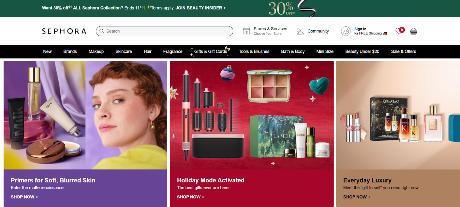
Example: Globally renowned beauty retailer Sephora offers personalized product recommendations to customers through its virtual app, which leverages AI and AR. The app, based on users' skin tone, facial features, and more, helps customers find the perfect products, allowing them to skip the in-store trials.
8. Offer Intutive Navigation
Easy navigation helps users find information or services easily, enhancing user satisfaction, engagement, and conversion rates.
A hierarchical menu structure helps customers understand that products are organized logically with categories and subcategories, while breadcrumbs allow customers to backtrack easily.
More importantly, the menus should be clearly labeled, allowing users to move through the site seamlessly. Visual cues like underlines, colors, and icons could also be very helpful, as they indicate clickable content and differentiate it from regular content. Finally, ensure navigation is optimized for all devices, including tablets, smartphones, desktops, and more.
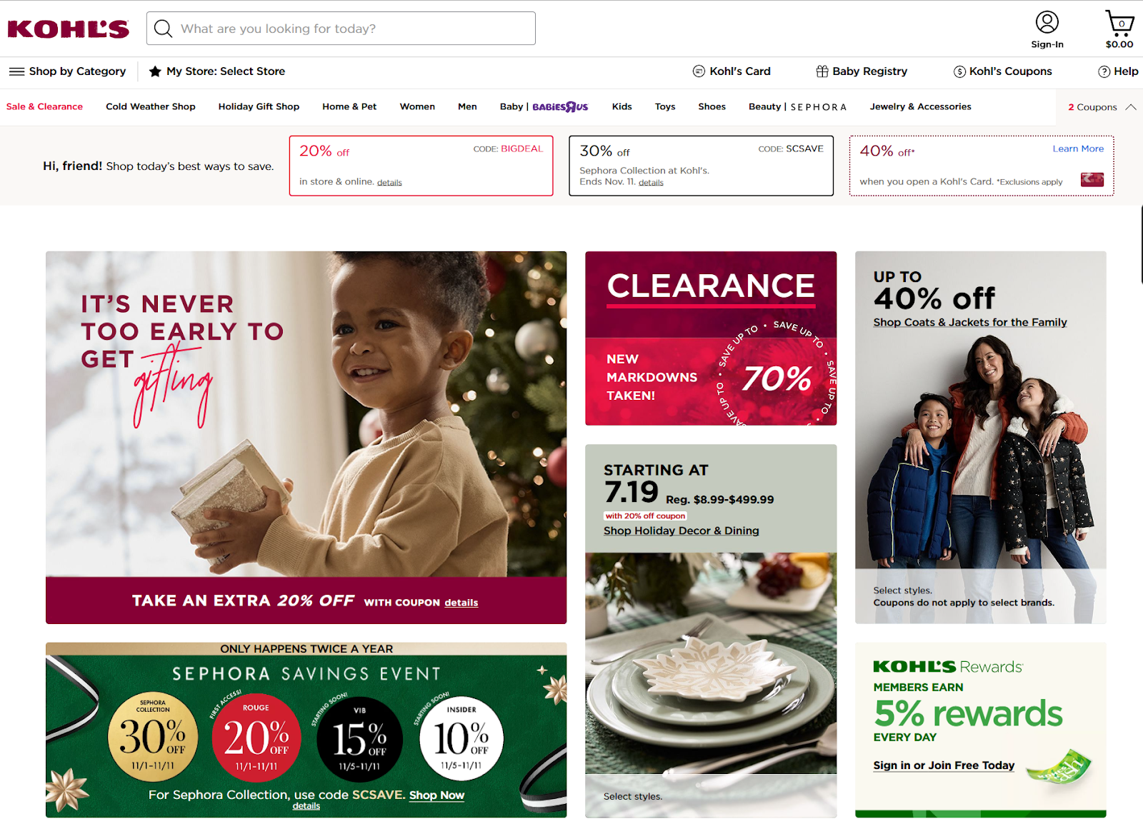
Example: American retail chain Kohl’s sells tens of thousands of products online. And see how they have maximized their navigation menu to help people find the right product.
9. Implement Call to Action
A call to action is a visual cue to visitors about the next step on a customer journey. Usually, it’s the homepage or product page. When clicked, the visual cue, in the shape of a button, allows the user to make purchases or sign up for a newsletter.
CTA buttons have action-oriented descriptions written on them, such as “Buy Now,” “Sign Up,” or “Join.” Ensure that you position your CTAs in prominent places on your website so that users can easily see them, for instance, right at the end of the product description or maybe at the top. The buttons should have contrasting colors, guaranteeing user attention and prompt clicks.
Example: Lyft, a rider app, only wants you to download its app. The description and CTA clearly motivate the visitor to tap the download button.

Final Thoughts:
There you go! 9 ecommerce web design best practices and examples to get your ecommerce web design strategy right. However, these are just the tip of the iceberg because there are tons of best practices out there, which you should also check out if you do not implement them. Knowledge is power, specifically in the ecommerce arena. Keeping up with the customers’ needs and matching the UX of your website is the only way for e-commerce businesses to move forward in the coming years.

